Note of Bootstrap-4
- Version 4.2 -
Cat: ICT
Pub: 2021
#:2100a
Bootstrap community
21106u
Note of Bootstrap-4
Bootstrap-4のまとめ
Index
Why
HTML and CSS are new computer languages of the Information Age. Bootstrap is a modern dialet widely used in busy cities.
Key
; ; 3Cards; Breadcrumb; btn; Carousel; Gas; ; Lightbox; ; Responsive; ;
Résumé
Remarks
>Top 0. Basics
of Brootstrap4:
- Basics
0. Basics of Bootstrap4:
- Bootstrapの開発経緯:
- 当初はTwitter社が制作したHTML/CSS framework。現在はOSS framework。
HTML5のdoctypeに準拠
- CDN利用: HTMLにいくつかの専用linkを設定するだけ。
- Resposibility:
- 応答性の高いGrid system、JQueryによる強力なPlug-inが特徴で、PC、Tablet、Smartphone の各デバイスでも見やすいResponsive Designを構築できる。
Resiponsive design対応は、jQuery (JavaScript libraryやPopper.js )でcontrolされる。
- <meta name="viewport" content="width=device-width, initial-scale=1, shrink-to-fit=no">
- Template Source Codeを参照する: Web画面上で、右click>Menu>ページのソースを表示
- 留意点: 単なるCopy & Pasteではダメで、CSSとJSの一部が相対pass指定を要調整。
- Sample siteのcodeで、特にCSSの指定をチェックする。
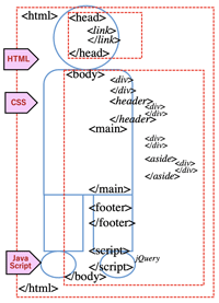
- HTML+CSS+Javascript+BootstrapからWeb上で動くProgramming 言語を実感する。
- 記述するコード例: <html>{<head><body>(<footer><jQuery>)}の順
- <!doctype html>
<html lang="ja">
<head>
<!-- Required meta tags -->
<meta charset="utf-8">
<meta name="viewport" content="width=device-width, initial-scale=1, shrink-to-fit=no">
<!-- Bootstrap CSS -->
<link rel="stylesheet" href="https://stackpath.bootstrapcdn.com/bootstrap/4.3.1/css/bootstrap.min.css" integrity="sha384ggOyR0iXCbMQv3Xipma34MD+dH/1fQ784/j6cY/iJTQUOhcWr7x9JvoRxT2MZw1T" crossorigin="anonymous">
<title>Hello, world!</title>
</head>
<body>
<h1>Hello, world!</h1>
<!-- Optional JavaScript -->
<!-- jQuery first, then Popper.js, then Bootstrap JS -->
<script src="https://code.jquery.com/jquery-3.3.1.slim.min.js" integrity="sha384- q8i/X+965DzO0rT7abK41JStQIAqVgRVzpbzo5smXKp4YfRvH+8abtTE1Pi6jizo"crossorigin
="anonymous"></script>
<script src="https://cdnjs.cloudflare.com/ajax/libs/popper.js/1.14.7/umd/popper.min.js" integrity="sha384UO2eT0CpHqdSJQ6hJty5KVphtPhzWj9WO1clHTMGa3JDZwrnQq4sF86dIHNDz0W1" crossorigin="anonymous"></script>
<script src="https://stackpath.bootstrapcdn.com/bootstrap/4.3.1/js/bootstrap.min.js"
integrity="sha384-JjSmVgyd0p3pXB1rRibZUAYoIIy6OrQ6VrjIEaFf/nJGzIxFDsf4x0xIM+B07jRM" crossorigin="anonymous"></script>
</body>
</html>
- Grid system:
- 一連のContainer、Column、Rowを使用してコンテンツをlayoutする。
- HTMLとCSS:
- HTMLで文書構造、CSS (Cascading Style Sheets)でWebのデザインを指定。 Bootstrapでは予め用意されたCSSのスタイルを利用。
- sassは、デザインのcustomize用にのcss preprocessor言語。css coding の効率向上。
- _variables.scss ファイルでデザインを管理する。この変数を編集すると全体的なデザインの更新が可能
- 例: 角丸の有効・無効化
- 様々なtemplate:
Form、Button、Table、Navigation、Breadcrumb、Slide show、Form、Typographyなどが用意されている。
- Bootsrap+WordPress:>WP
- BootstrapWP: CMS "WordPress"用にcustomizeされたBootstrapである。
- Container: 基本のlayoutである。
- <div class="container"> <!-- Content here --> </div>
- 全体に広がる全幅の場合は、container-fluidを使用する。
<div class="container-fluid"> ... </div>
- 行(row)で列(column)を囲む。水平paddingがある。.no-guttersで行のmarginや列のpadding削除可能。
- 列は行毎に12の内の列の数を示す。.col-4で3つの等幅列。widthは親要素の%で設定
- Grid responsiveは5つのgrid breakpointがある。例: .col-sm-4、色背景の変更
- Viewport: meta tagの一種; deviceに合わせてsizeを変える
- <meta name="viewport" content="width=device-width, initial-scale=1, shrink-to-fit=no">
- Character装飾:
- <p class="h1">h1</p>
<p class="h2">h2</p>...
<p class="h6">h6</p>
- 表示用見出し
<p class="display-1">表示用見出し1</p>
<p class="display-2">表示用見出し2</p>
- a
0. Basic s of Bootstrap4
-
>Top 1. Anchor:
- Anchor:
1. Anchor:
- HTMLで重要なlinkの作り方: <a=Anchor href=Hypertext Reference...>
- <a href="link先のURL">linkする所</a>
- HTML5の記述法:
- <a id="ユニークな名前">スクロール先名</a> [a tagのid属性で属性値を指定する; →Name属性]
- <a href="#title">title</a>
[href属性の属性値に上記1.で指定したidに#を付加; a tag以外に h1, p, divなどの要素でid属性が指定できる; →id属性]
- 例: <a href="#sec1">section1</a>
<div id="sec1">section1の内容</div>
- jQueryの記述:
<!--jQuery.jsの読み込み>
<script type="text/javascript" src="http://ajax.googleapis.com/ajax/libs/jquery/1.3.2/jquery.min.js">
</script>
<!---スムーズスクロール部分の記述-->
<script>
(function(){
//で始まるアンカーをクリックした場合の処理
('a[href^=#]').click(function(){
//スクロールの速度
var spped=400; //ミリ秒
//アンカー値の取得
var href=(this).attr("href");
//移動先を取得
var tgarget=(href=="#"||href==""?'html":href);
//移動先を数値で取得
var position=target.offset().top;
//スムーススクロール('body,html').animate({scrollTop:position},speed,'swing');
return false;
});
});
</script>
- jQueryの記述例:
- <!doctype html>
<html>
<head>
<meta charset="UTF-8">
<title></title>
<script type="text/javascript" src="http://ajax.googleapis.com/ajax/libs/jquery/1.3.2/jquery.min.js"></script>
<script>
(function(){
// #で始まるアンカーをクリックした場合に処理('a[href^=#]').click(function() {
// スクロールの速度
var speed = 400; // ミリ秒
// アンカーの値取得
var href= (this).attr("href");//移動先を取得vartarget=(href == "#" || href == "" ? 'html' : href);
// 移動先を数値で取得
var position = target.offset().top;
// スムーススクロール
$('body,html').animate({scrollTop:position}, speed, 'swing');
return false;
});
});
</script>
<style>
div{width:auto; height:500px;}
a.button{font-size:12px;}
</style>
</head>
<body>
<h3><a href="http://kyasper.com/?p=1219">元のページに戻る</a></h3>
<h2 id="index">目次</h2>
<ul>
<li><a href="#sec1">section1</a></li>
<li><a href="#sec2">section2</a></li>
<li><a href="#sec3">section3</a></li>
<li><a href="#sec4">section4</a></li>
<li><a href="#sec5">section5</a></li>
<li><a href="sec#6">section6</a></li>
</ul>
<div id="sec1">
<h2>section1</h2>
<a class="button" href="#index">▲ 目次にもどる</a>
</div>
<div id="sec2">
<h2>section2</h2>
<a class="button" href="#index">▲ 目次にもどる</a>
</div>
<div id="sec3">
<h2>section3</h2>
<a class="button" href="#index">▲ 目次にもどる</a>
</div>
<div id="sec4">
<h2>section4</h2>
<a class="button" href="#index">▲ 目次にもどる</a>
</div>
<div id="sec5">
<h2>section5</h2>
<a class="button" href="#index">▲ 目次にもどる</a>
</div>
<div id="sec6">
<h2>section6</h2>
<a class="button" href="#index">▲ 目次にもどる</a>
</div>
</body>
</html>
- Page内link (jump)とアンカー要素(a tag)のid, name, class属性:
- id属性: Page内linkのjump 先(HTML5推奨)やcssの指定が可能
- name属性: Page内linkのjump 先 (非推奨)
- class属性: cssでアンカー要素(a tag)のstyle調整
- >Top GAS user: GAS=Google Apps Script), Googleが提供するprogramming環境:
- やや敷居が高いが本格的な自動処理が可能。
1. アンカー::
- Anchor:
- HTML Structure:
>Top 2. Button:
- CSS
- JS
- Badges
- Badge
- Breadcrumb
- Button
- Button group
2. Button:
- <link>を<head>の内側に設定
- <link rel="stylesheet"> href="https://stackpath.blotstrapcdn.com..."
- JavaScript plug-in (jQuery, Popper.js, etc.): <script> を</body>の前に設定
- <script src="https://code.jquery.com/jquery...
<script src="https://cdnjs.cloudflare.com/...
<script src="https://stackpath.bootstrapcdn.com/...
- 相対的なfont size: h1〜h6
- <h1>Example heading <span class="badge badge-secondary">New</span></h1>
- <h2>Example heading <span class="badge badge-secondary">New</span></h2><h6>Example heading <span class="badge badge-secondary">New</span></h6>
- Badge color::
- <span class="badge badge-primary">Primary</span>
<span class="badge badge-secondary">Secondary</span>
- Rounded badge color:
- <span class="badge badge-pill badge-primary">Primary</span>
- <a>要素に適用すると、hover時にfocus:
- <a href="#" class="badge badge-primary">Primary</a>
- <a>要素に. badge classを付与すると、batch にlink:
- <a class="badge badge-primary" href="#">Primary</a>
- >Top Breadcrumb: パンくずリスト
- <nav aria-label="breadcrumb">
<ol class="breadcrumb">
<li class="breadcrumb-item"><a href="#">Home</a></li>
<li class="breadcrumb-item active" aria-current="page">Library </li>
</ol>
</nav>
- >Top Buttons (Btn): ボタンスタイル:
- <button type="button" class="btn btn-primary">Primary</button>
- <a>の機能として利用: role="button"を適用
- <a class="btn btn-primary" href="#" role="button">Link</a>
- Outline button (透明ボタン):
- <button type="button" class="btn btn-outline-primary">Primary</button>
- Large/Small button: (大小ボタン):
- <button type="button" class="btn btn-primary btn-lg">Large button</button>
- <button type="button" class="btn btn-primary btn-sm">Small button</button>
- Active・ボタン:
- <button type="button" class="btn active">Active button</button>
- 親Blockの幅のボタン:
- <button type="button" class="btn btn-primary btn-lg btn-block">Block level
- Button group:
- グループ内のボタン:
- <div class="btn-group" role="group" aria-label="...">...</div>
- Dropdown+Button group組合せ:
- <div class="btn-group" role="group" aria-label="Button group with nested dropdown">
<button type="button" class="btn btn-secondary">1</button>
<button type="button" class="btn btn-secondary">2</button>
<div class="btn-group" role="group">
<button id="btnGroupDrop1" type="button" class="btn btn-secondary dropdown-toggle"
data-toggle="dropdown" aria-haspopup="true" aria-expanded="false">
Dropdown
</button>
<div class="dropdown-menu" aria-labelledby="btnGroupDrop1">
<a class="dropdown-item" href="#">Dropdown link</a>
<a class="dropdown-item" href="#">Dropdown link</a>
</div>
</div>
</div>
2. ボタン:
>Top 3. Card:
- Card
3. Card:
- Card: 柔軟で拡張性のあるContainer: カードには固定幅なし→親要素の幅に広がる
→sizing optionsでcustomize可能
- Content types: カード内に画像、text, list, linkを挿入
- <div class="card">
<div class="card-body">
This is some text within a card body.
</div>
</div>
- Card title; Card Subtitle; Text
- <div class="card" style="width: 18rem;">
<div class="card-body">
<h5 class="card-title">Card title</h5>
<h6 class="card-subtitle mb-2 text-muted">Card subtitle</h6>
<p class="card-text">Some quick example text to build on the card title
and make up the bulk of the card's content.</p>
<a href="#" class="card-link">Card link</a>
<a href="#" class="card-link">Another link</a>
</div>
</div>
- カードの中に、画像上にtext 下に:
- <div class="card" style="width: 18rem;">
<img card-img-top" width="100%" height="180"
<div class="card-body">
<p class="card-text">Some quick example text to build on
the card titleand make up the bulk of the card's content.</p>
</div>
</div>
- カードの中にリスト作成:
- <div class="card" style="width: 20rem;">
<ul class="list-group list-group-flush">
<li class="list-group-item">Cras justo odio</li>
<li class="list-group-item">Dapibus ac facilisis in</li>
<li class="list-group-item">Vestibulum at eros</li>
</ul>
</div>
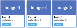
- Kitchen sink: カードの中に複数contents
- <div class="card" style="width: 18rem;">
<img card-img-top" src="images/notepc-graph.jpg"
alt="image of the standard course"
<div class="card-body">
</h4><p class="card-text">HP作成・Web集客の習得方法</p>
<a href="#" class="btn btn-primary">詳細を見る</a>
</div>
</div>
- >Top 横並び3 Cards: width設定しないと幅100%になってしまう。
- <div class="container">
<div class="row">
<div class="col-lg-4">
<div class="card">
<img class="car-img-top" src="images/notepc-wp.jpg"
alt=イメージ画像1
>
<div class="card=body">
<h4 class="card-title"エントリーコース></h4>
<p class="card-text">HPの初級口座</p>
<a href="#" class="btn btn-primary">詳細を見る</a>
</div>
</div>
</div>
<div class="col-lg-4">
<div class="card">
<img class="car-img-top" src="images/notepc-wp.jpg"
alt=イメージ画像2
>
<div class="card=body">
<h4 class="card-title"ミドルコース></h4>
<p class="card-text">HPの中級口座</p>
<a href="#" class="btn btn-primary">詳細を見る</a>
</div>
</div>
</div>
<div class="col-lg-4">
<div class="card">
<image class="car-img-top" src="images/notepc-wp.jpg"
alt=イメージ画像3
>
<div class="card=body">
<h4 class="card-title"アドバンストコース></h4>
<p class="card-text">HPの上級口座</p>
<a href="#" class="btn btn-primary">詳細を見る</a>
</div>
</div>
</div>
</div>
</div>
3. カード:
- Three Cards
- Color:
>Top 4. Carousel:
- Carousel:
4. Carousel:
- >Top Carousel: メリーゴーラウンド式のslide show:
- <div id="carousel-1" class="carousel slide" data-interval="10000">
<ol class="carousel-indicators">
<li data-target="#carousel-1" data-slide-to="0" class="active"></li>
<li data-target="#carousel-1" data-slide-to="1"></li>
<li data-target="#carousel-1" data-slide-to="2"></li>
</ol>
<div class="carousel-inner">
<div class="carousel-item active">
<img class="d-block w-100" src="https://placehold.it/1200x400"
alt="First slide">
</div>
<div class="carousel-item">
<img class="d-block w-100" src=".https://placehold.it/1200x400"
alt="Second slide">
</div>
<div class="carousel-item">
<img class="d-block w-100" src="https://placehold.it/1200x400"
alt="Third slide">
</div>
</div>
<a class="carousel-control-prev" href="#carousel-1" role="button" data- slide="prev">
<span class="carousel-control-prev-icon" aria-hidden="true"></span>
<span class="sr-only">Previous</span>
</a>
<a class="carousel-control-next" href="#carousel-1" role="button" data- slide="next">
<span class="carousel-control-next-icon" aria-hidden="true"></span>
<span class="sr-only">Next</span>
</a>
</div>
4. カルセール:
>Top 5. Container:
- Container
- Column
- CSS優先順位
5. Container:
- Container: Contentsを中央寄せにする。
- 方法1: Page内contents を全てcontainerに入れる。(昔のやり方)
- 方法2: 幅一杯に表示したいpartを囲む。(Pageにリズムが出る)
- Browser幅の最大は1170px; 最小は768px (左右marginなし; 通常は15pxとってある)
- Box layout方法:
- 行の定義は、何個分の列幅かでBoxを配置する。
<div class="row m-t-1">
<!--0px以上で10列幅のbox; 背景色primary-->
<div class="col-xs-10 bg-primary"></div>
</div> <div class="row m-t-1">
<div class="col-sm-6 bg-success"></div>
</div> <div class="row m-t-1">
<div class="col-md-2 bg-info">x</div>
</div>
- 複数breakpointの指定:
<div class="row">
<div class="col-xs-6 col-sm-12 col-md-2 bg-primary>
</div>
</div>
- Column割合指定:
- .col-{breakpoint}-{n}で画面サイズに応じたColumnの割合を変更できる
- sm以上の時は4:4:4の割合で、md以上の場合2:8:2、sm以下の場合は縦方向。
<div class="container-fluid">
<div class="row">
<div class="col-sm-4 col-md-2">A</div>
<div class="col-sm-4 col-md-8">B</div>
<div class="col-sm-4 col-md-2">C</div>
</div>
</div>
- Gridを入れ子nestingにする
<div class="container-fluid">
<div class="row">
<div class="b">A
<div class="row">
<div class="col-4">X</div>
<div class="col-4">Y</div>
<div class="col-4">Z</div>
</div>
<div class="col-6">B
</div>
</div>
</div>
- a
- CSSの優先順位:
- Selectorの指定方法と、記述した場所・読み込み順で決まる。
- CSSは、より詳しい指定を優先する (詳細度)
- Universal selector: * [0.0.0.0]
- Type selector: h1, p, div, span, table [0.0.0.1]
- Classs selector: .abc [0.0.1.0]
- ID sector: #abc [0.1.0.0]
- ID sector > Class sector > Type selctor [ICT]
- 注: [0.0.1.0]>[0.0.0.10]
- CSSは、撞点数でも後から書かれたものが優先 [上書きの原理]
- CSS記述場所は、1) head内CSS、2) 外部CSS、3) body内にinline記述
Inline記述は、[1.0.0.0]で最優先
- head内記述と外部CSS記述は同等で、後に読み込まれた方が優先。
通常は外部CSSよりhead内記述が後に記述されるので head>外部CSS
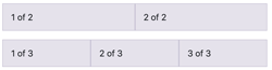
- Auto-layout columns: 自動均等画面一杯レイアウト
- <div class="container">
<div class="row">
<div class="col"> 1 of 2
</div>
<div class="col"> 2 of 2
</div>
</div>
<div class="row">
<div class="col"> 1 of 3
</div>
<div class="col"> 2 of 3
</div>
<div class="col"> 3 of 3
</div>
</div>
</div>
- Row columns: 行列グリッド:
responsive .row-cols-* classを使用してcontentsとlayout
を適切に指定。
.row-cols-auto によって列に自然な幅が設定される。(>card layout制御)
- 1行2列で設定:
<div class="container">
<div class="row row-cols-2">
<div class="col">1列目</div>
<div class="col">2列目</div>
<div class="col">3列目</div>
<div class="col">4列目</div>
</div>
</div>
- 1行3列で設定:
<div class="container">
<div class="row row-cols-3">
<div class="col">1列目</div>
<div class="col">2列目</div>
<div class="col">3列目</div>
<div class="col">4列目</div>
</div>
</div>
- Viewportに応じて列数が変化:
<div class="container">
<div class="row row-cols-1 row-cols-sm-2 row-cols-md-4">
<div class="col">1列目</div>
<div class="col">2列目</div>
<div class="col">3列目</div>
<div class="col">4列目</div>
</div>
</div>
5. Container:
- Breakpoint区間:
- 0px< xs <544px
- 544px< sm <768px
- 768px< md <992px
- 992px< lg <1200px
- 1200px< xl
- .col-xs-10
0px以上で10列幅のbox
- .col-sm-6
544px以上で6列幅のbox
- .col-md-2
768px以上で2列幅のbox
- Boxの背景色は
bg-primaryなどで指定
- breakpointは最小幅以上の全てに影響する。
.col-sm-4はsm, md, lgg, xl, xxlに適用
- Containerはcontentsを中央に配置し、水平方向に空白あり
- .container: pixcel幅
- .container-fluid: 横幅一杯
- .container-md: 両方組合せ
- rowでcolumnを囲む
- Gutter classは列のcontents間のgapで水平方向のpaddingによって作成:
padding-right; padding-left; gutterの幅は1.5rem(24px)
- Horizontal gutters:
.px-* classを使用
.px-4でpudding増やす
- Auto layout column:
a
a
>Top 6. Display:
20. Display:
- 表示utilityを利用して、componentのdisplayの値をresponsiveに切り替える。
- inline表示:横並び表示: .d(-{breakpoint})-inline
- <div class="d-inline p-2 bg-primary text-white">d-inline</div>
<div class="d-inline p-2 bg-dark text-white">d-inline</div>
- block表示:縦積み表示 .d(-{breakpoint})-block
- <span class="d-block p-2 bg-primary text-white">d-block</span>
<span class="d-block p-2 bg-dark text-white">d-block</span>
- grid表示: .d-grid
- <span class="d-grid p-2 bg-primary text-white">d-grid</span>
- <span class="d-grid p-2 bg-dark text-white">d-grid</span>
- inline-block表示:横並び幅高さ指定表示: .d(-{breakpoint})-inline-block
- <div class="d-inline-block p-2 bg-primary text-white">
<h3>d-inline-block</h3> ブロック1
</div>
<div class="d-inline-block p-2 bg-dark text-white">
<h3>d-inline-block</h3> ブロック2
</div>
- table表示:
テーブル表示<table>のような表示 .d(-{breakpoint})-table;
テーブル行表示<tr>のような .d(-{breakpoint})-table-cell;
テーブルセル表示<td>のような .d(-{breakpoint})-table-cell
.d-table-row
- <div class="d-table">
<div class="d-table-row">
<p class="d-table-cell p-2 bg-primary text-white">d-table</p>
<p class="d-table-cell p-2 bg-dark text-white">d-table</p>
</div>
<div class="d-table-row">
<p class="d-table-cell p-2 bg-primary text-white">d-table</p>
<p class="d-table-cell p-2 bg-dark text-white">d-table</p>
</div>
</div>
- flex container表示: (flexbox layoutによる表示)
- .d(-{breakpoint})-flex
- flex inline container表示:(flexbox layoutによる表示)
- .d(-{breakpoint})-inline-flex
- {breakpoint}): sm(小), md(中), lg(大), xl(特大), xxl(超特大)を選択
- コンテンツを横幅一杯に配置する(width指定なし)
- <!-- コンテンツを横幅ぴったりに配置 -->
<div class="d-flex">
<div class="p-2 flex-fill">メニュー</div>
<div class="p-2 flex-fill">メニュー</div>
<div class="p-2 flex-fill">メニュー</div>
</div>
- a
- a
20. ディスプレイ:
>Top 7. Dropdown:
- Dropdown
7. Dropdown:
- Dropdown: Plag-inを利用してlink listを表示するドロップボタン
- 基本構造:
- <div class="dropdown">
<button class="btn btn-secondary dropdown-toggle" type="button"
data-toggle="dropdown"> ドロップダウンボタン
</button>
<div class="dropdown-menu">
<a class="dropdown-item" href="#">メニュー</a>
<a class="dropdown-item" href="#">メニュー</a>
<a class="dropdown-item" href="#">メニュー</a>
</div>
</div>
- Dropdown button:
- <div class="dropdown">
<button class="btn btn-secondary dropdown-toggle" type="button"
id="dropdownMenu2" data-toggle="dropdown" aria-haspopup="true"
aria-expanded="false"> Dropdown
</button>
<div class="dropdown-menu" aria-labelledby="dropdownMenu2">
<button class="dropdown-item" type="button">Action</button>
<button class="dropdown-item" type="button">Another action</button>
<button class="dropdown-item" type="button">Something else her </button>
</div>
</div>
- a
- a
- a
7. ドロップダウン:
>Top 8. Emmet
8. Emmet:
- Emmet Shorthand: +Tab; the essential toolkit for Web developers
- tag: →<tag></tag>
- .: . →<div class=""></div>
- #: →<div id=""></div>
- >: 要素の中に右要素挿入; ul>li
- $: 展開した時に連番
- h2: →」<h2></h2>
- p: →<p></p>
- +: 同じ階層に右要素を置く
- *2: →左の要素を2個生成
- bd+: →border: 1px solid #000;
- bdrs4: →border:radius: 4px;
- bg#000: →background: #000000;
- bsh0-0-3-0#000: →box-shadow: 0 0 3px 0 #000000;
- c#fff: →color: #ffffff;
- db: →display: block;
- dis: →→font-size: 16px;
- link: →<link rel="stylesheet" href="">
- m0-a:→ margin: 0 auto;
- mb1e: →margin-bottom: 1em;
- mb32: →margin-bottom: 32px
- p15: →padding: 15px;
- p8-12-8-12: padding: 8px 12px 8px 12px;
- psa: →position: absolute;
- psr: →position: relative;
- tac: →text-align: center;
- tf: →transform:
- trs: →transition:
- w150: →width: 150px;
- !: →
- <!doctype html>
<html lang="en">
<head>
<meta charset="UTF-8">
<title>Document</title>
</head>
<body>
</body>
</html>
- nav>ul#menu>li*5>a[href=#]: →
- <nav>
<ul id="menu">
<li><a href="#"></a></li>
<li><a href="#"></a></li>
<li><a href="#"></a></li>
<li><a href="#"></a></li>
<li><a href="#"></a></li>
</ul>
</nav>
8. Emmet略字入力:
>Top 9. Flex:
- Flex
9. Flex:
- Flex (=CSS FlexBox):
- Gridに加えてFlex layoutを実装; 細かい数字なしにlay out可能。
- .d-inline-flexでインラインのFlex containerを作成する。
<!-- Flexコンテナ -->
<div class="d-flex">子要素がFlexアイテムになる</div>
<div class="d-inline-flex">インラインのFlexアイテムを作成</div>
- .flex-columnをつけると縦並びのコンテンツを作成
<!-- 縦並び -->
<div class="d-flex flex-column">
<div class="p-2">Flex item 1</div>
<div class="p-2">Flex item 2</div>
<div class="p-2">Flex item 3</div>
</div>
- Responsibe Flex: 指定なしは、最小deviceから; break pointつけると変更
<!-- 最小デバイスサイズから -->
.d-flex
<!-- smサイズから -->
.d-sm-flex
.d-md-flex
.d-lg-flex
.d-xl-flex
- コンテンツの左右添えのclass:
<!-- 左右に揃える -->
<div class="d-flex justify-content-start">左揃え</div>
<div class="d-flex justify-content-end">右揃え</div>
<div class="d-flex justify-content-center">中央揃え</div>
<div class="d-flex justify-content-between">両端に均等揃え</div>
<div class="d-flex justify-content-around">中央に均等揃え</div>
- コンテンツの上下揃えのclass:
<!-- コンテンツを上下に揃える -->
<div class="d-flex align-items-start">上揃え</div>
<div class="d-flex align-items-end">下揃え</div>
<div class="d-flex align-items-center">全体の上下に中央揃え</div>
<div class="d-flex align-items-baseline">コンテンツの上下に中央揃え</div>
<div class="d-flex align-items-stretch">背景の上下に広げる</div>
<!-- コンテンツのグループを上下に揃える -->
<div class="d-flex align-content-start">上揃え</div>
<div class="d-flex align-content-end">下揃え</div>
<div class="d-flex align-content-center">全体の上下に中央揃え</div>
<!-- 特定のコンテンツだけ上下に揃える -->
<div class="d-flex align-self-start">上揃え</div>
<div class="d-flex align-self-end">下揃え</div>
<div class="d-flex align-self-center">全体の上下に中央揃え</div>
- 上下揃えをResponsiveにする。
<!-- justify -->
.justify-content-start
.justify-content-sm-end
.justify-content-md-center
.justify-content-lg-between
.justify-content-xl-around
<!-- align -->
.align-items-start
.align-items-sm-end
.align-items-md-center
.align-items-lg-baseline
.align-items-xl-stretch
<!-- fill -->
.flex-fill
.flex-sm-fill
.flex-md-fill
.flex-lg-fill
.flex-xl-fill
9. Flex:
>Top 10. GAS:
- GAS
10. GAS:
- GAS=Google Apps Script: JavaScript 1.6ライク; Goolge server上で実行
- Gmail, Goolge map, Google calendar, Goolge spreadsheetなどGoogle toolsやserviceを連携するprogramming言語
- できること:
- Goolge上での作業の自動化:
- fileの共有管理
- gmail宛配信
- WebからのScraping (importxml関数); 他のserver不要
- Web app開発: 情報共有、日程調整tool
- 外部appとの連携; Chatwork, Slack (Group chat); Spread sheetで条件に応じて業務上対応することを自動message
10. GAS:
>Top 11. Image
- Image
11. image:
- 画像を通常・角丸楕円で囲む:
- <div class="container">
<div class="row">
<div class="col">
<h2>通常</h2>
<img src="images/sample.jpeg" alt="">
</div>
<div class="col">
<h2>角丸</h2>
<img src="images/sample.jpeg" alt="" class="rounded">
</div>
<div class="col">
<h2>円(楕円)</h2>
<img src="images/sample.jpeg" alt="" class="rounded-circle">
</div>
</div>
</div>
- img-thumnbnailで画像をサムネイル表示:
- <div class="container">
<div class="row">
<div class="col">
<h2>通常</h2>
<img src="images/sample.jpeg" alt="">
</div>
<div class="col">
<h2>サムネイル</h2>
<img src="images/sample.jpeg" alt="" class="img-thumbnail">
</div>
</div>
</div>
- Block要素化して中央寄せ:
- <div class="row">
<div class="col">
<p>ブロッククラス・中央寄せ指定の画像</p>
<img class="mx-auto d-block" src="http://clue-design.com/wp- content/uploads/2017/11/cat5" />
</div>
</div>
- ソース表示; 中央揃え・左揃え・右揃え
- <img src="#" class="mx-auto d-block">
- <!-- 左揃え -->
<img src="#" class="float-left">
<!-- 右揃え -->
<img src="#" class="float-right">
- a
- a
- a
11. 画像:
- 画
>Top 11b. jQuery:
- jQuery:
11b. jQuery:
- JavaScript Library: JavaScriptをより簡単な記法で実現, 2006年release
- 特徴: write less, do more
- Browserの違いを吸収
- HTMLの部品=DOM操作が簡単
- text boxの中身の取得変更
- 画面部品表示・非表示・再表示
- CSSをユーザ操作に合わせて変更
- Ajax処理を簡単に記述
- Server間通信:
- 同期通信: HTMLからsubmit処理によりServer通信
- 非同期通信: AjaxによりJavaScriptからServer通信
- jQueryを使ったWeb:
- Fade-in, face-out, animation, effect可能
- mouse over, click & menu
- realtime image更新可能
- responsive site
- user動作でcss変更可能
- Ajax機能で外部file読み込み可能
- 学習サービス: https://dotinstall.com; https://dotinstall.com/lessons
>Top 12. Jumbtron:
- Jumbotron
12. Jumbotron:
- <SONYのJumboTron: サイトの華であるMain imageの横幅一杯の表示, Responsive対応。
- 以下のCSSをindex.htmlに追記:
.jumbotron {background:url(image/title.jpg) center no-repeat; background-size: cover;}
- <div class="jumbotron" style="width:30rem;">
<h1 class="display-4">Hello, world!</h1>
<p class="lead">This is a simple hero unit ...</p>
<hr class="my-4">
<p>It uses utility classes for ...</p>
<a class="btn btn-primary btn-lg" href="#" role="button">Learn more</a>
</div>
- 角の丸くないJumbotron: .jubotron-fluidを追加、.containerを配置
- <div class="jumbotron jumbotron-fluid">
<div class="container">
<h1 class="display-4">Hello, world!</h1>
<p class="lead">This is a simple hero unit, a simple jumbotron-style component
for calling extra attention to featured content or information.</p>
<hr class="my-4">
<p>It uses utility classes for typography and spacing to space content out
within the larger container.</p>
<a class="btn btn-primary btn-lg" href="#" role="button">Learn more</a>
</div>
</div>
- a
- a
12. Jumbotron:
>Top 13. Lightbox:
- LightBox:
13. Lightbox:
- ふわっと拡大表示されるモーダル画像:
modal=relating to mode or form as oposed to substance, 様相・様態・閉じるまで他のことはできない状態(modal pop-up ⇔modeless)・またはその感覚;
ある時間内にユーザが入力すべき情報量を制限することでが画面遷移を容易にするメリットの反面、UI上ユーザにfrustrationを与えてまで制限を加えるのは誤りとの指摘もある。
- Modalとは
元画面より優先的に反応(選択・回答・alert)してもらう場合の画面
(Dialogue box=Modal画面)
- LihtBoxの場合、thumbnailをクリックすると、その場で拡大画像を表示する。
- このsub-windowは、閉じるボタンか暗転部分を押すだけでもとの画面に戻る。
- 画像のみならず、同様のUIで別文章や別HTMLをmodal windowで表示できる (→Colorbox)。
- 公式サイトからjs directory内のlightbox.js、css directory内のlightbox.cssを取り出し、
html内の<head>〜</head>に読み込む; LightBoxはJQueryで記述されているのでJQueryの読込みをLightBoxより前に行う。
- <link href="https://cdnjs.cloudflare.com/ajax/libs/lightbox2/2.7.1/
css/lightbox.css" rel="stylesheet">
<script src="https://cdnjs.cloudflare.com/ajax/libs/lightbox2/2.7.1/js
/lightbox.min.js" type="text/javascript"></script>
- 使用方法:
<a>〜</a> タグ内に拡大させたい画像リンク、その<img>タグにthumbnail画像を配置。
thumnail画像を用意しなくても問題ないが、thumbnailがあると表示が早い。
<a>.〜</a> タグのpropertyにdata-lightbox=""を追加する。
<a href="hoge.jpg" data-lightbox="fuga" data-title="hoge">
<img src="hoge_thumb.jpg" alt="hoge画像">
</a>
- ¶1. <!doctype html>
2. <html lang="ja">
3. <head>
4. <!-- Required meta tags -->
5. <meta charset="utf-8">
6. <meta name="viewport" content="width=device-width, initial-scale=1, shrink-to-fit=no">
7.
8. <!-- Bootstrap CSS -->
9. <link rel="stylesheet" href="https://stackpath.bootstrapcdn.com/bootstrap/4.4.1/css/bootstrap.min.css" integrity="sha384-Vkoo8x4CGsO3+Hhxv8T/Q5PaXtkKtu6ug5TOeNV6gBiFeWPGFN9MuhOf23Q9Ifjh" crossorigin="anonymous">
10.
11. <!-- Lightbox for Bootstrap CSS; ヘッダー内以下3行のModal用cssを読み込む。
なお、■■2-3行目のscript要素はbody用の最後</body>tagの直前に記述する-->
<link href="https://cdnjs.cloudflare.com/ajax/libs/lightbox2/2.7.1/css/lightbox.css" rel="stylesheet">
■<script src="https://code.jquery.com/jquery-1.12.4.min.js" type="text/javascript"></script>
■<script src="https://cdnjs.cloudflare.com/ajax/libs/lightbox2/2.7.1/js/lightbox.min.js" type="text/javascript"></script>
14. <title>Hello, world!</title>
15. </head>
16. <body>
17. <h1>Hello, world!</h1>
18.
19. <!-- Optional JavaScript -->
20. <!-- jQuery first, then Popper.js, then Bootstrap JS -->
21. <script src="https://code.jquery.com/jquery-3.4.1.slim.min.js" integrity="sha384-J6qa4849blE2+poT4WnyKhv5vZF5SrPo0iEjwBvKU7imGFAV0wwj1yYfoRSJoZ+n" crossorigin="anonymous"></script>
22. <script src="https://cdn.jsdelivr.net/npm/popper.js@1.16.0/dist/umd/popper.min.js" integrity="sha384-Q6E9RHvbIyZFJoft+2mJbHaEWldlvI9IOYy5n3zV9zzTtmI3UksdQRVvoxMfooAo" crossorigin="anonymous"></script>
23. <script src="https://stackpath.bootstrapcdn.com/bootstrap/4.4.1/js/bootstrap.min.js" integrity="sha384-wfSDF2E50Y2D1uUdj0O3uMBJnjuUD4Ih7YwaYd1iqfktj0Uod8GCExl3Og8ifwB6" crossorigin="anonymous"></script>
24.
25.<!-- Lightbox for Bootstrap --Modal用のjavascriptをBootstrap JSより下に設定>
26. <script src="https://cdnjs.cloudflare.com/ajax/libs/ekko-lightbox/5.3.0/ekko-lightbox.min.js"></script>
27.
28. <!-- メイン部分 --ここにModal画像を設置>
29. <div class="container">
30. <div class="row my-4 text-center">
31. <div class="col">
32. <a href="sakura.jpg" data-lightbox="abc" data-title="桜写真拡大" data-footer="フッター">
33. <img src="sakura-thumbnail.jpg" alt="桜写真" class="img-fluid my-2 border">
34. </a>
35. </div>
36. </div>
<!-- ボディ最下部にモーダル用javascriptを設置 -->
- <script type="text/javascript">
- $(document).on('click', '[data-toggle="lightbox"]', function(event) {
- event.preventDefault();
- $(this).ekkoLightbox();
- });
- </script>
<script src="https://code.jquery.com/jquery-1.12.4.min.js" type="text/javascript"></script>
<script src="https://cdnjs.cloudflare.com/ajax/libs/lightbox2/2.7.1/js/lightbox.min.js" type="text/javascript"></script>
46. </body>
47. </html>
- ¶メイン部分別の事例:
a(href=basePath + "/img/big_img@2x.jpg", data-toggle="lightbox"
,data-title="拡大する画像",alt='拡大する画像')
img(src=basePath + "/img/thumbnail@2x.jpg",
alt='サムネイル',width='100' ,height='100')
- 別ページへの表示: <a>tagのrel属性にinsertを支援
- <html>
<head>
<meta http-equiv="content-type" content="text/html;charset=utf-8">
<title>Sample</title>
<link rel="stylesheet" href="lightbox.css" type="text/css" media="all">
<link rel="stylesheet" href="main.css" type="text/css" media="all">
<script type="text/javascript" src="prototype.js"></script>
<script type="text/javascript" src="lightbox.js"></script>
</head>
<body>
<h1>Lightbox Gone Wild! サンプル</h1>
<a href="about.html" class="lbOn">»Lightboxについて</a>
</body>
</html>
- 画像のグループ分け: data-lightboxの値を同じにすることでまとめる。
- <a href="img01.jpg" data-lightbox="group-a" data-title="旅の画像1"><img src="..."></a>
<a href="img02.jpg" data-lightbox="group-a" data-title="旅の画像2"><img src="..."></a>
<a href="img03.jpg" data-lightbox="group-a" data-title="旅の画像3"><img src="..."></a>
<a href="img04.jpg" data-lightbox="group-b" data-title="犬の画像1"><img src="..."></a>
<a href="img05.jpg" data-lightbox="group-b" data-title="犬の画像2"><img src="..."></a>
- a
13. ライトボックス:
- ふわっと拡大表示されるモーダル画像:
>Top 14. List:
- List Group
14. List:
- List:
- マークなしリスト
<ul class="list-unstyled">
<li>リスト1</li>
<li>リスト2</li>
<li>リスト3</li>
</ul>
- 横並びリスト
- List Group: .list-groupはリストグループ、.list-group-itemはその要素
- 基本設定
<ul class="list-group">
<li class="list-group-item">Item #1</li>
<li class="list-group-item">Item #2</li>
<li class="list-group-item">Item #3</li>
</ul>
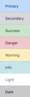
- 色付きのリストグループ:
<ul class="list-group">
<li class="list-group-item list-group-item-primary">Primary</li>
<li class="list-group-item list-group-item-secondary">Secondary</li>
<li class="list-group-item list-group-item-success">Success</li>
<li class="list-group-item list-group-item-danger">Danger</li>
<li class="list-group-item list-group-item-warning">Warning</li>
<li class="list-group-item list-group-item-info">Info</li>
<li class="list-group-item list-group-item-light">Light</li>
<li class="list-group-item list-group-item-dark">Dark</li>
</ul>
14. リスト:
- List Group: .list-groupはリストグループ、.list-group-itemはその要素
>Top 15. Media Object:
- Media Object
15. Media Object:
- .mediaおよび.media-bodyを用いて画像とTextの説明
- <div class="media">
<img class="mr-3" src="img/64x64.gif" alt="64x64 image">
<div class="media-body">
<h5 class="mt-0">HTML 5.2</h5>
This specification defines the 5th major version, second minor revision
of the core language of the World Wide Web: the Hypertext
Markup Language (HTML). In this version, new features ¥continue...
</div>
</div>
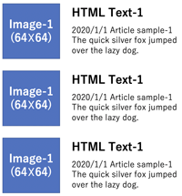
- <Li>に.media を用いてメディアリストの表示: >Fig.
- <ul class="list-unstyled">
<li class="media">
<svg class="bd-placeholder-img mr-3" width="64" height="64" xmlns="http://www.w3.org/2000/svg" preserveAspectRatio="xMidYMid slice" focusable="false" role="img" aria-label="Placeholder: 64x64"><title>Placeholder</title><rect width="100%" height="100%" fill="#868e96"/><text x="50%" y="50%" fill="#dee2e6" dy=".3em">64x64</text></svg>
<div class="media-body">
<h5 class="mt-0 mb-1">List-based media object</h5> Cras sit amet
</div>
</li>
<li class="media my-4">
<svg class="bd-placeholder-img mr-3" width="64" height="64" xmlns="http://www.w3.org/2000/svg" preserveAspectRatio="xMidYMid slice" focusable="false" role="img" aria-label="Placeholder: 64x64"><title>Placeholder</title><rect width="100%" height="100%" fill="#868e96"/><text x="50%" y="50%" fill="#dee2e6" dy=".3em">64x64</text></svg>
<div class="media-body">
<h5 class="mt-0 mb-1">List-based media object</h5> Cras sit amet
</div>
</li>
<li class="media">
<svg class="bd-placeholder-img mr-3" width="64" height="64" xmlns="http://www.w3.org/2000/svg"preserveAspectRatio="xMidYMid slice" focusable="false" role="img" aria-label="Placeholder: 64x64"><title>Placeholder</title><rect width="100%" height="100%" fill="#868e96"/><text x="50%" y="50%" fill="#dee2e6" dy=".3em">64x64</text></svg>
<div class="media-body">
<h5 class="mt-0 mb-1">List-based media object</h5> Cras sit amet nibh libero,
</div>
</li>
</ul>
- メディアリストのNesting:
- <div class="media">
<svg class="bd-placeholder-img mr-3" width="64" height="64" xmlns="http://www.w3.org/2000/svg" preserveAspectRatio="xMidYMid slice" focusable="false" role="img" aria-label="Placeholder: 64x64"><title>Placeholder</title><rect width="100%" height="100%" fill="#868e96"/><text x="50%" y="50%" fill="#dee2e6" dy=".3em">64x64</text></svg>
<div class="media-body">
<h5 class="mt-0">Media heading</h5> Cras sit amet nibh libero
<div class="media mt-3">
<a class="mr-3" href="#">
<svg class="bd-placeholder-img" width="64" height="64" xmlns="http://www.w3.org/2000/svg" preserveAspectRatio="xMidYMid slice" focusable="false" role="img" aria-label="Placeholder: 64x64"><title>Placeholder</title><rect width="100%" height="100%" fill="#868e96"/><text x="50%" y="50%" fill="#dee2e6" dy=".3em">64x64</text></svg>
</a>
<div class="media-body">
<h5 class="mt-0">Media heading</h5> Cras sit amet nibh libero
</div>
</div>
</div>
</div>
15. メディアオブジェクト:
- Media List:
>Top 16. Navigation:
- Navigation
16. Navigation:
- Navigation Tabs: .nav-tabsを使用して, JavaScript plug-in でタブ領域を作成:
- <ul class="nav nav-tabs">
<li class="nav-item">
<a class="nav-link active" href="#">Active</a>
</li>
<li class="nav-item">
<a class="nav-link" href="#">Link</a>
</li> <li class="nav-item">
<a class="nav-link" href="#">Link</a>
</li>
<li class="nav-item">
<a class="nav-link disabled" href="#">Disabled</a>
</li>
</ul>
16. ナビゲーション:
- Navigation Tabs: .nav-tabsを使用して, JavaScript plug-in でタブ領域を作成:
>Top17. Pagination:
- Pagination
17. Paginatrion:
- Pagination: <nav>要素にaria-label属性を入れる
- <nav aria-label="">
<ul class="pagination">
<li class="page-item"><a class="page-link" href="#" aria-label="前へ">
<span aria-hidden="true">«</span>
</a></li>
<li class="page-item"><a class="page-link" href="#">1</a></li>
<li class="page-item"><a class="page-link" href="#">2</a></li>
<li class="page-item"><a class="page-link" href="#" aria-label="次へ">
<span aria-hidden="true">»</span>
</a></li>
</ul>
</nav>
- ページ送りの位置: 中央揃え・右端揃え:
<!-- 中央揃え -->
<nav aria-label="">
<ul class="pagination justify-content-center">
<li class="page-item disabled"><a class="page-link" href="#" aria-label="前へ">
<span aria-hidden="true">«</span>
</a></li>
<li class="page-item"><a class="page-link" href="#">1</a></li>
<li class="page-item active"><a class="page-link" href="#">2</a></li>
<li class="page-item"><a class="page-link" href="#" aria-label="次へ">
<span aria-hidden="true">»</span>
</a></li>
</ul>
</nav>
<!-- 右揃え -->
<nav aria-label="">
<ul class="pagination justify-content-end">
<li class="page-item disabled"><a class="page-link" href="#" aria-label="前へ">
.....
</ul>
</nav>
17. ページ送り:
- Pagination:
>Top 18. Responsive:
- Responsive
18. Responsive:
- Responsive Design: PC, Tablet, Smartphoneの画面に応じてデザインを自動調整
- col-{breakpoint}-{n}で指定
- Break point:
- xs: extra smalll; 767px以下
- sm: small; 768-991px
- md: medium; 992-1199px
- lg: large; 1200px以上
- <div class="row">
<div class="col-sm-4 col-md-2"></div>
<div class="col-sm-4 col-md-8"></div>
<div class="col-sm-4 col-md-2"></div>
</div>
- xsの時はBreak pointの記述なし
<div class="row">
<div class="col-4 col-md-2"></div>
<div class="col-4 col-md-8"></div>
<div class="col-4 col-md-2"></div>
</div>
- ¶Respoinsive images:
- <div class="container">
<h2>レスポンシブイメージ</h2>
<div class="row">
<div class="col">
<img src="images/notepc-wp.jpeg" alt="" class="img-fluid">
</div>
<div class="col">
<img src="images/notepc-wp.jpeg" alt="" class="img-fluid">
</div>
<div class="col">
<img src="images/notepc-wp.jpeg" alt="" class="img-fluid">
</div>
<div class="col">
<img src="images/notepc-wp.jpeg" alt="" class="img-fluid">
</div>
</div>
18. レスポンシブ:
>Top 19. Sass:
- Sass
19. Sass:
- Sass (): bootstrap4のデザイン変更は、1) CSS上書きまたは2) Sassでの一括変更。
- Bootstrap4のデザイン部分は、Sassの方が楽。
- Bootstrap4が提供するscss fileの変数定義を変更する必要性→変更後はcompileが必要。→デザイン変更対応工数が劇的に減少する。
- npm (https://nodejs.org/ja)も必要なので、node.jsもinstall する。
- a
19. Sass:
>Top 20. Table:
- WordPress
20. Table:
- Containerの中にTableを作成する:
- 基本的なTable:
<div class="container">
<table class="table">
<thead>
<tr>
<th>#</th>
<th scope="col">見出し</th>
<th scope="col">見出し</th>
<th scope="col">見出し</th>
</tr>
</thead>
<tbody>
<tr>
<th scope="row">1</th>
<td>テーブルのセル</td>
<td>テーブルのセル</td>
<td>テーブルのセル</td>
</tr>
</tbody>
</table>
</div>
- ゼブラ調のTable:
<div class="container">
<table class="table table-striped">
<thead>
<tr>
<th>#</th>
<th scope="col">見出し</th>
<th scope="col">見出し</th>
<th scope="col">見出し</th>
</tr>
</thead>
<tbody>
<tr>
<th scope="row">1</th>
<td>テーブルのセル</td>
<td>テーブルのセル</td>
<td>テーブルのセル</td>
</tr>
</tbody>
</table>
</div>
- 縦線付きTable:
<div class="container">
<table class="table table-bordered">
<thead>...
- 縦線なしTable:
<div class="container">
<table class="table table-borderless">
<thead>...
- 背景色がhoverするtable:
<div class="container">
<table class="table table-hover">
<thead>...
- 行間の狭いTable:
<div class="container">
<table class="table table-sm">
<thead>...
- Tableの背景色を変える:
.table-primary
.talbe-info
.table-danger...
20.Table:
>Top 21. WordPress:
- WordPress
21. WordPress:
- CMS (Contents Management Service)用のPHPとMySQLで開発されたOSSブログ・ソフトウェア。Blogの機能やページ更新の仕組みが組み込まれていて、多機能はHPの作成が可能
- 拡張性と自由度が高い分、プロ向けツール
- PHPの知識が必要。
- テンプレートは沢山あるが、HTML・CSSを駆使している。また独自機能を追加している場合もあり、簡単ではない。
- 多数のプラグインが揃っているが、組合せによっては動かない場合もある。また日本語非対応もある。
- ブログ感覚でのページの更新が可能で、最大のメリット
- 世界のHPの1/4、CMSの1/2以上がWordPressで作成されている。Securityの攻撃を受けやすい。
- Version upするとProgramの微調整が必要となる場合がある。
21. WordPress:
>Top 22. xxxx<M>:
22. xxxx:
>Top 23. xxxx<M>:
23. xxxx:
>Top 24. xxxx<M>:
24. xxxx:
>Top 25. xxxx<M>:
25. xxxx:
>Top 26. xxxx<M>:
26. xxxx:
>Top 27. xxxx<M>:
27. xxxx:
>Top 28. xxxx<M>:
28. xxxx:
>Top 29. xxxx<M>:
29. xxxx:
>Top 30. xxxx<M>:
30. xxxx:
>Top 31. xxxx<M>:
31. xxxx:
>Top 32. xxxx<M>:
32. xxxx:
>Top 33. xxxx<M>:
33. xxxx:
>Top 34. xxxx<M>:
34. xxxx:
>Top 35. xxxx<M>:
35. xxxx:
>Top 36. xxxx<M>:
36. xxxx:
Comment
- a
- a
Note of Bootstrap-4- Version 4.2 - |
Cat: ICT |
|
Bootstrap community |
21106u |
Note of Bootstrap-4 |
|
|
Index |
||
Why |
HTML and CSS are new computer languages of the Information Age. Bootstrap is a modern dialet widely used in busy cities. | |
Key |
; ; 3Cards; Breadcrumb; btn; Carousel; Gas; ; Lightbox; ; Responsive; ; |
|
Résumé |
Remarks |
|
>Top 0. Basics
|
0. Basics of Bootstrap4:
|
0. Basic s of Bootstrap4 |
>Top 1. Anchor:
|
1. Anchor:
|
1. アンカー::
|
>Top 2. Button:
|
2. Button:
|
2. ボタン: |
>Top 3. Card:
|
3. Card:
|
3. カード:
|
>Top 4. Carousel:
|
4. Carousel:
|
4. カルセール: |
>Top 5. Container:
|
5. Container:
|
5. Container:
a a |
>Top 6. Display: |
20. Display:
|
20. ディスプレイ: |
>Top 7. Dropdown:
|
7. Dropdown:
|
7. ドロップダウン: |
>Top 8. Emmet |
8. Emmet:
|
8. Emmet略字入力: |
>Top 9. Flex:
|
9. Flex:
|
9. Flex: |
>Top 10. GAS:
|
10. GAS:
|
10. GAS: |
>Top 11. Image
|
11. image:
|
11. 画像:
|
>Top 11b. jQuery:
|
11b. jQuery:
|
>Top 12. Jumbtron:
|
12. Jumbotron:
|
12. Jumbotron: |
>Top 13. Lightbox:
|
13. Lightbox:
|
13. ライトボックス:
|
>Top 14. List:
|
14. List:
|
14. リスト:
|
>Top 15. Media Object:
|
15. Media Object:
|
15. メディアオブジェクト:
|
>Top 16. Navigation:
|
16. Navigation:
|
16. ナビゲーション:
|
>Top17. Pagination:
|
17. Paginatrion:
|
17. ページ送り:
|
>Top 18. Responsive:
|
18. Responsive:
|
18. レスポンシブ: |
>Top 19. Sass:
|
19. Sass:
|
19. Sass: |
>Top 20. Table:
|
20. Table:
|
20.Table: |
>Top 21. WordPress:
|
21. WordPress:
|
21. WordPress: |
>Top 22. xxxx<M>: |
22. xxxx: |
>Top 23. xxxx<M>: |
23. xxxx: |
>Top 24. xxxx<M>: |
24. xxxx: |
>Top 25. xxxx<M>: |
25. xxxx: |
>Top 26. xxxx<M>: |
26. xxxx: |
>Top 27. xxxx<M>: |
27. xxxx: |
>Top 28. xxxx<M>: |
28. xxxx: |
>Top 29. xxxx<M>: |
29. xxxx: |
>Top 30. xxxx<M>: |
30. xxxx: |
>Top 31. xxxx<M>: |
31. xxxx: |
>Top 32. xxxx<M>: |
32. xxxx: |
>Top 33. xxxx<M>: |
33. xxxx: |
>Top 34. xxxx<M>: |
34. xxxx: |
>Top 35. xxxx<M>: |
35. xxxx: |
>Top 36. xxxx<M>: |
36. xxxx: |
Comment |
|
|