Summary |
要約 |
>Top
0. Prologue:
- Color is the first step to multimedia. We have a sense of feeling
to recognize the object not only by its shape but by its color as
a contrast of its background.
|
0. プロローグ:
- 色はマルチメディアへの第一歩である。我々には物体をその形だけでなく、背景との対比でのその色によって認識する感覚が備わっているのだ。
|
>Top 1. History of Color:
-
Color of Primitive
Age:
- When human beings began to make things, they focused not
only to the shape for particular purpose, but also tried to
paint them in beautiful colors in the course of nature.
- 150 - 200,000 years ago:
They buried the dead in red clay, or painted the bones also
in red. The color red was regarded as a symbol of blood representing
life.
- 15,000 years ago:
The walls in the caves in Altamira in Spain and Lascaux in
France were pained in russet, black and ocher yellow.
- The colors of pigment in the ancient painting were black,
white, brown, russet, ocher yellow, and neither blue nor
green colors were found.
|
1. 色彩の歴史:
-
原始時代の色:
- 物を造ることを始めたときに、用途に適した形を作るだけでなく、美しい色を施す気持ちが自然に生まれた。
- 15-20万年前:
死体を赤土の中に埋葬したり、骨を赤く練ったりした。赤い血の色=生命力であった。
- 15,000年前:スペインのアルタミラやフランスのラスコーの洞窟画は赤褐色、黒、黄土色で彩色されていた。
- 原始絵画の顔料の色は、黒・白・褐色・赤褐色・黄土色等の色調で、青と緑の系統色は見られない。
|
-
>Top Color of Ancient Egypt:
- Wide range of colors were used in designing and decoration of tomb
and coffin. The basic colors were red, yellow, green , blue, brown,
white, black, and gold leaf.
- The pigments were made from minerals; green from malachite,
cupric oxide, and terre verte, red/yellow/brown from ochet and
russet, and brilliant yellow from orpiment (arsenic sulfide)
- Ancient egyptian classified themselves into the red race.
They painted their faces in reddish color as a symbol of superior
race. (The beginning of beauty art)
- In portraits on walls, men were painted in reddish brown,
while women in yellowish brown.
- Color of gods, etc.:
Many colors were dedicated together with religious meanings.
- Osiris, god of rebirth: green.
- Ammon, god of sky: clear blue.
- Anubis, god of death: black in his fox head.
- Ceto?, good of evil: red.
- the Sun: yellow or gold
- Pepetuity of nature: green
- ground: purple
- sanctity of judge: blue
|
-
エジプトの色:
- 墳墓や棺の装飾模様には広範囲の色彩が使用された。基本色は、赤・黄・緑・青・褐色・白・黒および金箔であった。
- 特に、鉱物質の顔料が多い。緑は孔雀石や酸化銅や緑土の粉末。赤・黄・褐色は黄土や赤土。鮮やかな黄色は雄黄(石黄)であった。
- 古代エジプト人は、自らを赤色人種に類別し、他民族より有利なものとして赤色の顔料を顔に塗った。(美容術の始まり)
- 壁画の人物は、男は赤褐色に女は黄褐色に塗られた。
- 神々の色など:
多くの色は宗教的な意味で用いられた。
- オシリス、再生の神は緑
- アモン、天空の神は明るい青
- アヌビス、死者の神の狼頭は黒
- セト、悪神は赤
- 太陽:黄と金色
- 自然の永続性:緑
- 大地:紫
- 審判の神聖:青
|
-
>Top Color of Aegean Civilization:
- The unique colors typically at Knossos palace in Crete are described
as 'illusion of space.' The walls were made of plastered
adobe, and wooden pillars were pained white, red and black.
- The pigments were mostly minerals; white was calcium hydroxide,
black was shale or slate, yellow was ocher, light red was burned
ocher, red was magnetite, blue was cupric oxide, and green was
the mixture of blue and yellow.
- Cretan fine arts features refined color sense avoiding loud
primary colors, also gray was not used. Thus light and bright
delicate colors were mostly preferred.
- Men were pained in brown, while women in white. There were
unique coloring such as bluish green monkey, blue dappled hound,
rosy boar, and pink horse. This coloring might have affected
17C India such as pink elephant and blue god.
- Cretan jars were painted in black or dark brown as the ground
color, on which plants, fish, or swirl patterns were pained
in bright white, red, or yellow.
|
-
エーゲ文明の色:
- 典型的には、クレタ島のクノスス宮殿で、その独特な色は「空間の幻想」と評される。壁は漆喰を塗った日干し煉瓦で造られ、木柱は白、赤、黒で塗られた。
- 顔料は鉱物性であり、白は水和石灰、黒は頁岩または粘板岩、黄色は黄土、淡紅色は黄土を焼いたもの、赤は磁鉄鉱、青は酸化第二銅、緑は青と黄の混合であった。
- クレタ美術の特色は、色彩感覚が洗練され、原色の強烈さが避けられ、灰色も用いられず、全体に明るく輝かしいデリケートな色調が好まれた。
- 男性は褐色に、女性は白色に塗られた。また特異な彩色として、青緑の猿、青い斑文の猟犬、バラ色の猪、ピンクの馬が遊び戯れている。後17世紀のインドの美術にも影響を与えた
(ピンクの象、青色の神など) 。
- クレタの壺類は、黒や黒褐色を地色とし、そこに植物、魚、渦模様を白、赤、黄色の明色模様が描かれた。
|
-
>Top Color of Greek Civilization:
- Aristotelian chromatics described colors of the four elements;
air and water are white, fire and also the Sun are yellow, and
soil is originally white but is stained in various colors.
- Greek temples were made of white marble. In Doric style, the top of pillars was painted blue and red, and in Ionic style gold was used as well as blue and red, while in Corinthian style gold was mostly used.
- The Parthenon of Doric style showed virile colors of beauty
under clear sky; with pure white of line of marble pillars
on which decoration of relief of primitive colors, continuous
patterns of red and blue, and honeysuckle ornament of gold.
- Symbolic colors of their religion were used as ground of blue,
fire of red, water of green, and air of purple color.
- No Greek painting remained. It was believed to be a tempera,
mostly using white, yellow, black, and red, but blue was less
used. Green color was made from the mixture of black and yellow.
- Earlier Greek jars were pained by characters using black lines
on the base of reddish unglazed pottery.
- Greek colors were always subordinate to the shape. Light and
shadow were regarded as more important than hues of colors.
|
-
ギリシャ時代の色:
- アリストテレスの色彩学によれば、4元素である空気と水は白であり、火 (と太陽) は黄、 土は本来白であるが着色されていろいろな色になる。
- ギリシャ神殿には白の大理石が多く用いられ、ドーリス様式では、柱頭が青と赤で塗られ、イオニア様式では青と赤の他に金も用いられ、コリント様式では金の使用が盛んであった。
- ドーリス様式のパルテノン神殿は純白の大理石の柱列の上に、原色をほどこした群像のレリーフや赤や青の連続模様、金色の忍冬模様などが鮮やかに彩られ、澄み切った青空の下で力強い色彩の美を奏でていた。
- 宗教的な色のシンボルとして、青は大地、赤は火、緑は水、紫は空気で表現した。
- ギリシャ絵画は残っていない。それは文献によればテンペラ画で、色は白、黄、黒、赤が主で、青の使用は少なく、緑は黒と黄の混色によって得た。
- ギリシャの壺は、初期のものは素焼きに近い赤い素地の上に、黒い線で人物を描いた(黒絵)。
- ギリシャ時代の色彩は常に形態に従属しており、光と陰影が色相よりも重視された。
|
-
>Top Color of Roman Empire:
- The Ruins of Pompeii buried by the eruption of Vesuvius volcano
in 79, which tells us colors of the ancient Roman Empire. The
pigments were ocher, litharge (lead monoxide), white arsenic
(arsenic trioxide), cinnabar, red lead, cochineal, cobalt blue
glass, verdigris, and brown umber, etc.
- Color of closes in Roman Empire:
Romans began to use colors as a symbol of the class: Tyrian
purple, dyestuff obtained from mollusks of Murex, was so expensive
that only the emperor and aristocrat were allowed to use. Philosophers
wore blue, theologians black, medical doctors green, fortune-tellers
white, and lower class plain and sober or native color of sheep.
- Toga, a loose one-piece outer garment, was worn in public.
The emperor's and imperator's toga wore cloth stitched with
gold thread, and aristocrats and priests white cloth stitched
with red or purple thread.
- Women wore various pale and light colors, except white or
reddish orange at the time of wedding. But in this case purple
was limited only for upper class ladies.
|
-
ローマ時代の色:
- 79年のヴェスヴィオ火山の噴火によって埋没したポンペイ遺跡は古代ローマ帝国の色彩を伝えている。その顔料は黄土、密陀(一酸化鉛)、白砒(亜砒酸)、朱、鉛丹、コチニール、青コバルト・ガラス、緑青、ブラウン・アンバーなどであった。
- ローマ時代の服装の色:
ローマ人は階級の表示として被服の色を用い始めた。チュロス紫 (Murexの巻貝から採った染料) は非常に高価だったので皇帝や貴族だけが使用できた。哲学者は青の衣服、神学者は黒、医者は緑、占い師は白、下層階級は地味な単色か、または羊毛の自然色を着た。
- トーガは、公式の場で着用されたゆるやかな外衣である。皇帝と凱旋将軍は紫地に金糸で刺繍を、まあ貴族や僧侶は白地に赤または紫の縁飾りをしたトーガを着用した。
- 女性は各種の淡い明色を着た。但し結婚式には白または赤橙を着用した。この場合でも紫は上流階級の貴婦人のみに限られた
|
-
>Top Color of Middle Ages:
- During about a millennium from 4C to 14C every cultural activities
were concentrated in the belief of Christianity.
- Emperor Justinianus built St. Sophia as the center of Byzantine
art. Its dome was covered by glorious gold, the upper part of
wall golden mosaic, wainscot and the pillars colorful marble,
small windows glass and mica, and floor marble of mosaic.
- Mosaic painting characters or materials was made of stained
glass or sand, that is, four primary color of red, blue, green
and yellow.
- From middle of 12C, Gothic architecture arose. It was painted
both interior and exterior, especially the latter was in more
vivid color of red, green, orange, ocher, black and white, but
rarely painted in blue. Gothic churches had less walls, but
instead more stained glass which was saturated numinous five
colors of red, blue, green, yellow and brown.
- The churches symbolized the colors as follows:
- Black: mourning, the Friday before Easter in commemoration
of the crucifixion of Jesus.
- Green: Epiphany, or Christian feast celebrating manifestation
of divine nature of Jesus.
- Purple: Advent, a 40 days of prayer, fasting and penitence
in preparation for Christmas.
- Red: 7th Sunday after Easter commemorating the descent
of the Holy Sprit upon the disciples.
- White: Purity and innocence, Ascension, bodily rising
of Jesus into heaven on the 40th day after his Resurrection.
- Each lord had his family's own color, then pattern, whose
family member including servants wore the same family color
or pattern.
|
-
中世の色:
- 4世紀から14世紀までの約千年間、すべての文化活動はキリスト教信仰に集中していた。
- ユスティニアヌス帝は、ビザンチン芸術の中心として聖ソフィア寺院を建立した。その円天井は燦然たる金色に覆われ、壁の上部も金色のモザイク調、腰壁も円柱も色大理石、また小さな窓はガラスや雲母、床も大理石のモザイクであった。
- モザイクは着色されたガラスや砂で人物や事物を描いたもので、赤、青、緑、黄の4原色によって構成されていた。
- 12世紀半ば以降、ゴシック建築が興隆した。内装外装ともに彩色され、特に外部は鮮やかで赤、緑、橙、黄土、黒、白が多く、青はほとんど使われていない。ゴシック様式の教会は壁面が少なく、代わりにステンドグラスがあり、赤、青、緑、黄、茶色の神秘的な五彩の白によって満たされていた。
- 教会は各色を以下のシンボルとした。
- 黒:喪の色、復活祭の前の金曜日でイエスの貼り付けを記念する祭日
- 緑:顕現、イエスの神性が出現したことのキリスト教徒が祝うこと
- 紫:キリストの再臨。クリスマスの前40日間の祈祷、断食、贖罪
- 赤:聖霊降臨節、聖霊が使徒の上に降臨したことを祝う復活後7回目の日曜
- 白:純潔、無実、キリストの復活後40日目のイエスの昇天
- 各貴族の一門は、召使いに至るまで家門の色、後に柄を染め分けて着用した。
|
-
>Top Color of Renaissance:
- Pictures of Renaissance induced geographical perspective and
shading. These new technique enabled more realistic and actual
feeling of painting.
- Leonardo da Vinci,
universalist, wrote his coloration theory. But "Florentine
group" of the Renaissance emphasized order of formality
and rational composition rather than coloration.
- Later "Venetian group"represented by Vecellio Tiziano invented
technique of gorgeous colorful oil painting.
- Previous technique was fresco which is
the art of painting on fresh, moist plaster with pigments
dissolved in water, and
- tempera which pigment was mixed with
water-soluble glutinous materials such as size or egg yolk.
- Architecture of Renaissance pursued partial proportion and
embracing beauty of space, but almost losing the importance
of color. Renaissance could not regenerate the color of ancient
Greek, which mostly faded.
- "Majolica" was tin-glazed earthenware that was colored
in red, yellow, green, azure on white ground.
- Color of closes represented status of rich. Each city or village
had its own symbol color such as Sheriff or Gild meister in
14C Paris wore red and white two-toned coat of each side.
|
-
ルネッサンス時代の色:
- ルネッサンスの絵画は、幾何学的遠近法や明暗法を採用した。これら新たな技法は、一層写実的で実感的な画法を可能にした。
- 万能の人、レオナルド・ダ・ビンチは配色理論を記述した。しかしルネッサンスのフィレンツェ派は配色よりは形式の秩序や合理的な構成を重視した。
- その後、ティツィアーノに代表されるヴェネツィア派は油絵による絢爛多彩な油絵の技法を発明した。
- それ以前の技法は、下地の石灰の壁面が乾かぬ内に水性の絵の具で描く技法のフレスコ画であり、そして
- 顔料を糊や卵黄のような溶媒剤で練った水性絵の具で描くテンペラ画であった。
- ルネッサンスの建築は各部分の比例とそれを包含する空間美を求めたが、色の重要性は失った。ルネッサンスは古代ギリシャの色彩を復活できなかった。それらはほとんど褪色してしまった。
- 「マヨリカ」は白地に赤、黄、緑、藍などの色で錫の釉薬を施した陶器であった。
- 服装の色は富裕な身分を反映した。各都市や町ではシンボル色が用いられ、例えば、14世紀のパリの執行官やギルド長は反面が赤で他面が白の二色の上衣を着た。
|
-
>Top Color of Modern Age:
- In 16-17C Europe, "Baroque" style
art and architecture developed, emphasizing more elaborate ornamentation.
Versailles Palace built by Louis XIV decorated rooms as total
court arts of architecture, picture and sculpture.
- "Rococo" style of art originated
in 18C France was marked by more elegant curve and asymmetric
ornamentation.
- Rembrandt of
Netherlands painted deep color by the technique of impasto,
and expressed light and shadow, while Velazquez of Spain completed the technique of oil painting, and displayed
black and gray tint beauty.
- Porcelain introduced by Marco Polo in 13C was reproduced in
"Meissen" in Sachsen in 1709. Then in 1768 "Sevres"
porcelain made first in France became an object of envy with
elaborately decorated in Sevres blue, jonquil yellow, grass
green, rose du Barry, rose du Pompadour.
- In 1666 Newton separated the Sun light into spectrum by prism,
and clarified white light as mixture of all colors. On the contrary
Goethe countered in 1810 persisting that color should be pursued
by human inner speculation emphasizing more psychological and
physiological perception.
|
-
近世の色:
- 16-17世紀の欧州で、バロック様式の芸術と建築が発達し、更に豪華な装飾が強調された。ルイ14世が建てたベルサイユ宮殿は、部屋全体を建築、絵画、彫刻のすべてによる宮廷芸術にした。
- ロココ様式は18世紀のフランスで始まり、流麗な曲線と左右非対称の様式による華麗な装飾が特徴であった。
- オランダのレンブラントは絵の具の盛り上げ技法によって深い色で描き、光と影を表現した。一方スペインのベラスケスは油絵の技法を完成し、黒灰調の美しさを表現した。
- 13世紀にマルコポーロによって紹介された磁器は1709年に、ザクセンのマイセンで初めて再生された。その後1768年にフランスで製造されたセーヴルの磁器は、その豊かな美しさで羨望の的となった。それはセーヴル・ブルー、黄水仙色、草色、バリー・ローズ、ポンパドゥール深紅色などであった。
- 1666年にニュートンは太陽光をプリズムによって分光し、白光は全ての色の混合であることを明らかにした。それに対しゲーテは1810に反論し、色はあくまで人間の内的考察の面から究明すべきとし、より心理的、生理的作用を強調した。
|
-
>Top Color of 19th Century:
- The waves of French revolution and Industrial revolution developed
19C artistic faith such as establishment of selfhood, emphasis
of individuality, which led to freedom of coloration.
- Delacroix painted
bright and intense color found in Morocco.
- Corot expressed
delicate nuance of light which covers an object.
- Manet recognized
delicate relation of light and color in observing nature and
expressed in "ton clair."
- "Impressionnisme":
Manet, Monet, Pissaro, Sisley, Renoir, Cezanne opened group exhibition in 1874, then named themselves as Impressionnisme
since the third exhibition in 1877. They observed outside light
and recognized changes of colors; green leaves moment by moment
become blue, red, or yellow in a different situation. They painted
in pure dot of colors without mixing on the pallet. Sometimes
they apposed complimentary such as colors of red and green,
or yellow and purple.
- "Neo-impressionisme":
Seurat and Signac dissolved color of an object, expressed brightness
in contract dotted color (pointillisme) .
- "Postimpressionnisme"
Cezanne, Gauguin, Gogh etc. started
as the impressionists, began to paint in more contrast of intense
color.
- Cheret developed
polychrome lithograph for posters.
- Synthetic dye was made from coal-tar like Mauve (aniline reddish
purple), then Fuchsine (magenta)
|
-
19世紀の色:
- フランス革命と産業革命の波は、自己の確立、個性の強調という19世紀の芸術的信念を発達させた。それは色彩の解放に通じるものであった。
- ドラクロア:モロッコで見出した明るく強烈な色で描いた。
- コロー:対象物を包む微妙な光のニュアンスを表現した。
- マネ:自然観察によって光と色の微妙な関係に気づき、明るい色調トーン・クレールによって描いた。
- 印象派:
マネ、モネ、ピサロ、シスレー、ルノアール、セザンヌたちは1874年にグループ展を開き、その後1877年の第三回展から印象派展を名乗った。彼らは戸外の光を観察し、色の変化を感じ取った。緑の葉もある瞬間には青、赤、黄に状況次第で変化するというのである。パレットの上で混色せずに純粋な色の点によって描いた。時に赤・緑とか黄・紫という補色を並置した。
- 新印象派:
スーラ 、シニャックは対象物の色を分解し、色点の対比による光輝感を表現した
(点描画法) 。
- 後期印象派:
セザンヌ、ゴーギャン、ゴッホ等は印象派から出発しながらも、さらに強烈な色の対比で描いた。
- シェレはポスター用の多色の石版画を発展させた。
- モーヴ(アニリン赤紫) やフクシン(マジェンタ) と呼ばれる合成染料がコールタールから作られた。
|
-
>Top Color of 20C:
- 1905-08: "Fauvisme":
Matisse, Vlaminck, Derain, Braque,
Marquet, Rouault, Dufy painted in strong touch
mostly of vivid primary colors of red, yellow, blue, and green.
- 1910: "Cubisme":
Picasso emphasized
structure and expression of an object in demitint such as black,
brown, gray, and white rather to construct subjective image.
- "Abstrait"
Kandinsky considered
picture as a kind of music composed of color, line and shape,
expressed in near primary colors gradation. Miro is a painter of "Surrealisme"
enjoyed poetic sympathy with nature in the idiom of semiabstration.
- Color and war:
During two world wars, camouflage color contributed to war.
But infrared photograph and radar made camouflage effect meaningless.
- "Color conditioning"
Particular coloring was used to improve security, sanitation,
or amenity of building, transportation or machines, considering
the effects of psychology and physiology.
- Eg.: Walls of a surgery are painted in grayish green which
is complimentary to red.
- Neon sign:
In 1910 neon sign was first publicized at Paris Exhibition as
visual design.
- Color film:
In1935 US invented "Kodachrome", while in 1936 Germany
"Agfacolor."
- Color TV:
In 1951 US broadcast the first commercial color TV.
|
-
20世紀の色:
- 1905-08:フォーヴィスム(野獣主義):
マティス、ヴラマンク、ドラン、ブラック、マルケ、ルオー、デュフィは主として鮮明な赤、黄、青、緑の4原色の強いタッチで表現した。
- 1910:キュービズム:
ピカソは物体の構造と表現に主眼点を置き、黒、茶、灰、白など中間調でむしろ主観的なイメージを構成しようとした。
- "抽象美術"
カジンスキーは絵画は色と線と形によって構成された音楽であると考え、原色に近い階調によって表現した。ミロはヒュールレアリスム(超現実主義)の画家で、自然との詩的な交感を楽しみ、半抽象の作風を残した。
- 色彩と戦争:
第一次、第二次の大戦を通じて、カムフラージュの色が迷彩色として戦争に寄与した。しかし赤外線写真や電波探知機で迷彩色の意味はなくなった。
- "色彩調節"
色彩のもつ心理や生理的効果を利用して建物、交通機関、機械などの安全、衛生、快適性を改善するために使われる特定の色彩調節が行われた。
- ネオンサイン:
1910年にパリ万博でビジュアルデザインとしてネオンサインが初めて公開された。
- カラーフィルム:
1935年に米国でコダクロームが発明され、またドイツでは1936年にアグファカラーが発明された。
- カラーテレビ:
1951年に米国で最初の商用カラー放送が行われた。
|
>Top 2. What is Color?:
- Etymology of color:
- In Japanese "iro" (=color) came from "uruwashi"(=beautiful)
and "uruou"(=moisten). And Japanese"iro"
has another meaning of "sexual appetite, or lust."
- In Chinese character, "color" is made of "person"
+ "whirl", which means human mind appears as change
of complexion.
- "Matter is void"
In Buddhism, "color" means tangible material. All
materials have their own fate, whose essence is nonexistence,
that is "void."
- Feeling of color:
- We feel a certain color is attached on a shape. But when we
paint in white on white paper, we cannot see it. To see is to
recognize color and brightness. If there is no light, we can
see nothing.
- "A crow in a pitch-dark night" in Japanese expression
is not correct; any color of birds cannot be seen in a pitch-dark
night.
- Light is electromagnetic wave from 400 to 700 nm.
- Red: 700-610 nm
- Orange: 610-590 nm
- Yellow: 590-570 nm
- Green: 570-500 nm
- blue: 500-450 nm
- violet: 450-400 nm
- There are two types of light-sensitive receptor cells in the
retina: the one is sensitive to color in bright place, the other
to brightness in dark place.
- Color of light and color of things:
- Light source color:
This is color of a source which emits light by itself like the
Sun or fluorescent lamp.
- Object color:
This is color of an object which is shined other light source;
color reflected from the surface is called "surface
color", and color appearing when light passes
through an object is called "transparent color."
- Surface color is determined by different spectrum of reflectance.
- Color mixture:
- Additive mixture:
Three primary colors of light: red, green, and blue.
- Subtractive mixture:
Mixture of object colors becomes darker. There is no exact primary
colors of object color, but near primary colors are magenta,
yellow, and cyan; red is made by yellow and cyan, blue is by
magenta and cyan.
- Complementary color:
Mixture of complementary colors becomes achromatic; red and
cyan; green and magenta; yellow and bluish-violet.
|
2. 色彩とは何か:
- 色の語源:
- 日本での「いろ」の語源は「うるは(麗) し」および「うるほ(潤) ふ 」から由来。また「いろ」には色彩のほかに色情の意味がある。
- 漢字の「色」は「人」+「巴」で、これは人の心が顔色に現れること。
- 色即是空:
般若心経の言葉。色とはサンスクリットのルーパ(rupa)。色とは「有形の万物」をいい、これらの万物はすべて因縁の所生で、その本性は実有のものではなく空である」という意である。
- 色の感覚:
- 我々は形の上にある色がついていると感じる。しかし白い紙に白で描くと見えない。見るということは色と明るさを認識することである。もし光がなければ我々は見ることができない。
- 「闇夜にカラス」は正しくない。闇夜にはどんな色と鳥でも見えないのである。
- 光は400 nmから700 nmまでの電磁波である。
- 赤: 700-610 nm
- 橙: 610-590 nm
- 黄: 590-570 nm
- 緑: 570-500 nm
- 青: 500-450 nm
- 紫: 450-400 nm
- 網膜で光を感じる視細胞は2種類あり、一つは明るい所で色を感じ、他方は暗いところで明るさを感じる。
- 光の色と物体の色:
- 光源色:
これは物体自身が発する光による色をいう。(太陽、蛍光灯など)
- 物体色:
これは他の光源から照らされた物体の色をいう。表面から反射した色のことを"表面色"といい、物体を光が透過するときに現れる色を"透過色"という。
- 表面色は反射率の異なるスペクトルによって決まる。
- 色の混合:
- 加法混色:
光の三原色は、赤、緑、青
- 減法混色:
物体色の混色はいずれより暗くなる。物体色の厳密な原色はないが、原色に近い色としてgマゼンタ(赤紫) 、黄、シアン(青緑)の三色が使われる。赤は黄とシアンによって作れ、青はマゼンタとシアンで作れる。
- 補色:
補色の混色は無彩色となる。赤とシアン、緑とマゼンタ、黄と青紫である。
|
>Top 3.
Form of Color:
- Classification of color:
- We are mostly seeing surface color reflected from surface
of an object. There are two kinds of surface color; achromatic
color and chromatic color.
- Achromatic color has a feature of "brightness",
while chromatic color has three features of "hue",
"brightness", and "saturation."
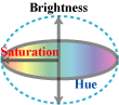 <Color
Cube> or Color Tree <Color
Cube> or Color Tree
Z-axis is brightness; along Z-axis brightness increases, changing
from "dark color", then "middle light color, to "light
color."
- The most vivid color is called "pure color."
Adding white to pure color is called "tint"
, while adding black "shade."
|
3. 色彩の表し方:
- 色の分類:
- 我々は多くは物体の表面から反射される表面色を見ている。表面色は2種類ある。無彩色と有彩色である。
- 無彩色は明度の属性だけがあり、一方、有彩色には色相、明度、彩度の三属性がある。
- <左図> 色立方体:または色の樹
Z軸は明度である。Z軸にそって暗色、中間色、明色に変化する。
- 最も彩度の高い色を純色と呼ぶ。純色に白を加えると明清色(ティント) に、また黒を加えると暗清色(シェード)と呼ばれる。
|
-
>Top Munsell proposed standard of color:
- Hue (H):
10 major hues is divided; Red (R), Yellowish-Red (YR), Yellow
(Y), Greenish-Yellow (GY), Green (G), Bluish-Green (BG), Blue
(B), Purplish-Blue (PB), Purple (P), Reddish-Purple (RP). Furthermore,
each major hue is subdivided into the grade 1 to 10, totaling
100 hues.
- Brightness (V=Value):
Brightness is divided 11 grades; Black N0, then get brighter
into N1, N2, ... until White N10.
- Saturation (C=Chroma):
Achromatic color is C0, then increases grade of saturation C1,
C2,... until pure color. Maximum is Red whose saturation is
14.
- Color expressed Munsell symbol is expressed as
H V/C
- Pure Red: is expressed as 5R 4/14
- Pure Yellow: 5Y 8/12
- Pure Green: 5G 5/8
- Pure Blue: 5B 4/8
- Pure Purple: 5P 4/12
|
-
マンセル表色系列:
- Albert H. Munsellが標準色を定めた。
- 色相(H=Hue):
まず10の主要色相に分類した。 即ち、
赤(R) 、黄赤(YR) 、黄(Y) 、黄緑(GY) 、緑(G) 、青緑(BG)、青(B) 、青紫(PB) 、紫(P)
、赤紫(RP)
さらに10色相は、ぞれぞれ1から10までに細分化した。
- 明度(V=Value) :
黒をN0とし、N1、N2、....と白のN10まで11段階の明度番号をつけた。
- 彩度(C=Chroma):
無彩色はC0であり、純色に至るまでC1、 C2と彩度段階が増加する。最大の彩度は赤の14である。
- マンセル記号による色表現は、
H V/C で表される。即ち、
- 純色の赤は、5R 4/14
- 純色の黄は、5Y 8/12
- 純色の緑は、5G 5/8
- 純色の青は、5B 4/8
- 純色の紫は、5P 4/12
|
>Top 4. How Color appears?:
- Light adaptation and dark adaptation:
- Brightness when we see objects under the Sun is 10 million
times brighter than under light of stars. As pupils can adjust
only 16 times, we automatically change sensitivity of retina.
- To adjust eyes in the darkness ("dark adaptation")
it takes about 30 minutes, but on the contrary to adjust eyes
in the brightness ("light adaptation") it
takes only about one minute.
- Chromatic adaptation:
- We also automatically adjust sensitivity of retina as if lighting
were white light. We feel colors of things in a fine day, in
a cloudy day, daytime or evening are same, but we feel only
the difference of brightness.
Because we tend to adjust colors in order to see things in the
most ideal situation.
- Brightness constancy:
- When we compare brightness of a gray paper in shining place
and a white paper in shadow, we can recognize color of the former
is gray, and the latter white, though the actual volume of reflection
of light is bigger in the former case. Because we see the ratio
of reflection of light, not the volume of reflection of light.
- We can feel similarly the brightness of a person's face near
window side and that of aisle side. But photograph has so such
function.
- Color constancy:
- We can well distinguish a white paper under red light and
a red paper under white light. Further, we can recognize a yellow
paper under red light, though the paper should be looked as
orange. Because we can recognize the color of light and color
of object.
|
4.色彩の見え方:
- 明暗順応と色順応:
- 太陽の下で物を見るときの明るさは、星の光の下で見る場合の1000万倍も明るい。瞳孔は16倍程度しか調整できないので、我々は自動的に網膜の感度を変化させている。
- 暗い所で目を慣らすには(暗順応) 約30分もかかるが、逆に明るい所に目を慣らすには(明順応) 約1分に過ぎない。
- 色順応:
- また我々は自動的に照明光を白色光であるかのように網膜の感度を調整する。晴天、曇天、昼間、夕方の物の色は我々は同じと認識し、単に明るさの違いだけを感じるのである。それは我々はできるだけ理想的な目の見え方をするように補正して物を見るからである。
- 明度恒常:
- 日の当たる場所にある灰色の紙と日陰にある白色の紙とを比べると、前者は灰色で、後者は白色であると認識できる。光の反射量は前者の方が大きいにも拘わらずである。それは我々は光の反射する割合を見ており、光の反射量を見ているのではないからである。
- 我々は窓側近くの人の顔と通路側の人の顔とを同じような明るさに感じる。しかし写真にはこのような機能はない。
- 色覚恒常:
- 我々は赤色光の下での白い紙と、白色光の下での赤い紙とをうまく区別できる。さらに赤色光の下の黄色の紙は橙色に見えるはずだが、我々は区別できる。それは我々は照明光と物体の色とを区別できるからである。
|
- >Top
- Memory color:
- We remember the color under white light as the standard, which
is referred to recognize colors in other situation. We are also
particularly sensitive to the color of human face.
- Twilight vision (Purkinje's phenomenon):
- When it gets dark, red or yellow looks darker, while green
or blue looked still brighter. Thus blue is recognized as a
color with slight quantity of light, but red requires 16 times
quantity of light.
- Color contrast (Local adaptation) :
- When looking around abruptly, there appears an afterimage
which is reverse of color and brightness, because delay of sensitivity
of the retina.
- Simultaneous contrast:
- When looking more than two colors simultaneously, these colors
affect each other and each color looks different whey looking
separately. There are brightness contrast, saturation contrast,
and complementary color contrast.
- Visibility (Liebmann's effect):
- Distinction of a figure on a ground color differs according
to combination of the two colors. The combination of yellow
and black is the most distinct.
- Advancing color and receding color:
- Warm colors like yellow or red look advanced than cold colors
like green or blue.
- Also bright color on dark background, and dark color on bright
background look advanced.
- Cognition of color and shape:
- When we look a thing, do we recognize a shape painted in color,
or a particular color on a different background color? Our sensitivity
of color arises without recognizing a shape, while sensitivity
of shape does not occur without color. Thus color is the basic
sense of sight.
- A baby less than 3 years old recognizes shape to grasp, but
a child of between 3 and around 6 years old recognizes color
which has stronger cognition. And yet a child of more than around
6 tends to recognize shape than color, because things are mostly
handled by their shapes.
|
- 記憶色:
- 我々は白色光の下での色を標準として記憶しており、他の状況での色を認識する際に参照する。また我々は特に人の顔の色には敏感である。
- 薄明時の色 (プルキニエ現象):
暗くなると赤や黄は暗く、緑や青が比較的明るく見えるようになる。青はごくわずかの光で感覚されるが、赤はその16倍の光量を必要とする。
- 色の対比 (部分順応):
- 目を急に動かすと、網膜の感度の回復が遅れ、色や明暗が反対になった残像が見える。
- 同時対比:
- 二色以上の色を同時に見るとき、相互に影響し張って、単独のときと色が変わって見える。明度対比、彩度対比、補色対比がある。
- 可視度 (リーブマン効果):
- 地色とその上に置かれた図形の区別は配色によって見やすい場合と見にくい場合とがある。黄色と黒の場合、可視度が最も高い。
- 進出色と後退色:
- 黄や赤のような暖色系の方が、緑や青のような寒色系よりも進出して見える。
- 背景が暗いときは明るい色ほど、また背景が明るいときはむしろ黒い色の方が進出する。
- 色と形の知覚:
- 我々が物を見えるのは、形に色がついているからか、あるいは色が背景と違うからか。形がなくても色の感覚は起こるが、色がなければ形の知覚は生じないので、色の方が視覚の基本である。
- 3歳以下の幼児は、物をつかむために形によって区別するが、3歳から6歳位までは色の知覚の強さにひかれるので、色によって区別する。ところが6歳以上の児童になると、物を取り扱うとき形によることが多いので、再び形によって区別するようになる。
|
>Top 5.
Color and feeling:
- Proper feeling of color:
Likes and dislikes of colors is called "expressive feeling"
which has big difference among individuals. Meanwhile, there is
objective feeling caused by the nature of colors, which is called
"proper feeling."
- cold or warm:
Brightness scarcely affect this feeling.
- light or heavy:
Hue and saturation scarcely affect this feeling.
- hard or soft:
Hue scarcely affect this feeling.
- clear or dark:
- exciting or quiet:
- gaudy or modest:
- Effect of color feeling:
- Freezing compartment is pained in warm color.
- After painting the black box in light green was felt lighter.
- Strong colors are used as marker or sign.
- The place of excitement is painted in gaudy colors.
|
5. 色彩と感情:
- 色の固有感情:
色の好き嫌いを表現感情といい、個人差も大きい。一方、色の性質によって客観的に感情が決まるものを固有感情という。
- 寒暖感:
- 軽重感:
- 硬軟感:
- 明快・陰気感:
- 興奮・沈静感:
- 派手・地味感:
- 色感情の効果:
- 冷凍室は暖色に塗られる。
- 黒い箱を薄い緑色に塗ると軽く感じる。
- 強い色は標識などに利用される。
- 興奮の場所は派手な色に塗られる。
|
-
>Top Language of colors:
- A certain color has particular meaning; this is color symbolism.
Symbol of colors is something common in the world, but it varies
according to manners and customs of nations.
- Red: Color of
fire, passion, blood; symbol of patriotism, revolution ,communism;
also color of danger, warning.
- In the West: dark red is a symbol of devil; red wine is
regarded as blood of Christ meaning sacrament or festival;
but pink is symbolic of health.
- In Japan: red means sincerity, congratulation.
- In China: red means happiness, marriage, dignity.
- In India: red means life, activity, cheerfulness, passion.
- Yellow: Color
of the Sun.
- In India: color of magnificence, brightness
- In China: color of the Emperor meaning greatness and sanctity.
- In Rome: color of the Emperor
- In Christianity: yellow was color of Judas' clothes; meaning
cowardice, vulgarity like "yellow dog."
- In Brazil: color of despair.
- In Islam: color of death
- In Burma: safflin yellow is color of Buddhist monks' robe.
- In Japan: color of baby clothes; meaning youth or inexperience.
- Green: Color
of nature, vegetation, growth; peace and safety.
- In China: color of prosperity, youth
- In India: color of peace and hope
- In Islam: color of the most attachment; color of nation.
- In the West: color of devil of jealousy; inexperience
like 'greener'
- In Austria: color of nobility
- Blue: Color
of blue sky.
- In the West: 'Blue Bird' of Maeterlinck means happiness.
"Blue blood" means noble family.
- In Christianity: color of Holy Mother's clothes; hope,
paradise.
- In Japan: color of youth, greenhorn
- Purple: color
of nobility, dignity。
- In China & Japan: color or the top
- In Greek: color of the King's clothes.
- In India: color of sadness
- In Brazil: color of sadness, particularly purple and yellow
means misfortune.
- White:color
of purity, innocence; pease, holiness; happiness
- In Japan: color of the Emperor's clothes.
- In Buddhism: color of fortune, sacredness (white elephant,
white bull)
- In China: color of mourning
- Black: color of darkness; misfortune, evil
(black list); silence, hell
- In Japan, etc.: color of mourning; blackhearted
|
-
色言葉:
- ある色は特定の意味を有する。これが色のシンボリズムである。色のシンボルは世界共通のこともあるが、各民族の風俗習慣によって違う。
- 赤:火、情熱、血の色;愛国、革命、共産主義のシンボル;また危険、警告の色
- 西洋:濃赤色は悪魔のシンボル。また赤葡萄酒はキリストの血で、聖餐や祭典の象徴。但しピンクは健康色
- 日本:赤は赤誠、慶祝の意味
- 中国:赤は幸福、結婚、威厳の意味
- インド:赤は生命、活力、陽気、熱烈の意味
- 黄:太陽の色
- インド:壮麗、光輝の色
- 中国:皇帝の色で偉大、神聖を意味
- ローマ:皇帝の色
- キリスト教:黄色はユダの着物の色、臆病、俗悪の意味。例: イエロードッグ
- ブラジル:絶望の色
- イスラム教:死の色
- ビルマ:サフラン黄色は仏教の僧侶の衣の色
- 日本:産衣の色、若さや未経験の意味
- 緑:自然、植物、成長の色。平和と安全
- 中国:繁栄、若さ
- インド:平和と希望
- イスラム教:最も愛着のある色、国家色
- 西洋:嫉妬の悪魔、未経験 (グリーナー)
- オーストリア:高貴の色
- 青:青空の色
- 西洋:メーテルリンクの青い鳥は幸福を意味。
ブルーブラッドとは名門の血統
- キリスト教:聖母マリアの服の色、希望、天国
- 日本:青春、青二才
- 紫:高貴、荘重な色
- 中国・日本:最高位の色
- ギリシャ:国王の服の色
- インド:悲しみの色
- ブラジル:悲しみの色、特に紫と黄は不運を意味
- 白:純粋、潔白;平和、神聖;幸福
- 日本:天子の服の色
- 仏教:幸運・神聖(白象、白牛)
- 中国:喪の色
- 黒:闇の色;不吉、悪(ブラックリスト) ;沈黙、地獄
|
-
>Top Tradition of colors:
- In China & Japan: 12 official ranks: Purple (moon), Blue
(wood) , Red (fire), Yellow (soil) , White (metal), Black (water)
- In Christianity: Red (St. Valentine), Orange (Halloween),
Green (St. Patrick), Brown (Thanksgiving), Red & green (Christmas),
Yellow & purple (Easter)
- In US: Black or Gray (January), Dark blue (February), White
or Silver (March), Yellow (April), Lavender or Lilac (May),
Pink or Rose (June), Sky blue (July), Dark green (August), Orange
or Golden (September), Brown (October), Purple (November), Red
(December)
- In US university: Red (theology), Yellow (Philosophy), White
(Literature), Green (Medical), Purple (Jurisdiction), Gold-yellow
(Science), Orange (Technology), Pink (Music), Black (aesthetics)
- In China & Japan: God of Blue dragon (East), White tiger
(West), Red phoenix (South), and Black turtle & snake (North)
|
-
色の慣習:
- 中国・日本:冠位十二階は、紫(月)、青(木)、赤(火)、黄(土)、白(金)、黒(水)
- キリスト教:赤(聖バレンタイン祭)、橙(万聖節) 、緑(聖パトリック祭)、茶(感謝祭)、赤と緑(クリスマス)、黄と紫(復活祭)
- 米国:黒・灰(1月)、紺(2月)、白・銀(3月)、黄(4月) 、ラベンダー・ライラック(5月) 、ピンク、薔薇(6月)
、青空(7月) 、深緑(8月) 、橙金(9月)、茶(10月)、紫(11月)、赤(12月)
- 米国の大学:赤(神学)、青(哲学) 、白(文学) 、緑(医学) 、紫(法学) 、金黄(理学) 、橙(工学) 、ピンク(音楽)
、黒(美学)
- 中国・日本:青龍(東) 、白虎(西) 、朱雀(南) 、玄武(北)
|
>Top 6. Aesthetics of color:
- What is beauty?:
- Platon: "Beauty arises from balance of rhythm."
- Greeks: "Beauty expresses unity in changes."
- G.T. Fechner, 19C: "Beauty is an order in the complex."
- H. Reed, 20C: "Beauty is unity of relation of forms recognized
by the five senses."
- Formal principle of beauty:
- Relation of parts:
Contrast (Dominance - Subordination), Similarity (Concord, Accent),
Symmetry (Bilateral symmetry, Radial symmetry, Dynamic symmetry,
Asymmetry), Repetition.
- Relation of quantity (space, time, strength):
Balance (Unbalance), Proportion (Golden section), Rhythm (Tone,
Gradation), Movement
- Unification of multiplicity:
Harmony (Contrast is a part of harmony; Harmonie, Valeur,
Ton), Order, Variety
|
6. 色彩の美学:
- 美とは何か:
- プラトン:"美は韻律の釣り合いから生じる。"
- ギリシャ:"美は変化の中に統一を表現する。"
- フェイヒネル(19C):"美は複雑さの中の秩序である。"
- リード(20C):"美とは五官が知覚する形式上の諸関係の統一である。"
- 美的形式原理:
- 部分の関係:
対照(支配-従属) 、類似(融和、強調) 、対称(左右対称、放射対称、動的対称、非対称) 、反復
- 数量(空間・時間・強度) の関係:
平衡(非平衡) 、比例(黄金分割) 、律動(調子、階調) 、動勢
- 多様の統一:
調和(対照もまた調和の一部分、仏アルモニー、仏ヴァルール、仏トーン) 、秩序、変化
|